A fingerprint-inspired brand identity for Vindaura, built around one idea: every career path is as unique as the person who walks it.
The Brief
Vindaura helps learners discover the career that is uniquely theirs. The brand needed an identity that felt personal, confident and forward-looking — something that speaks to students and young professionals at the moment they choose their direction.
The Idea
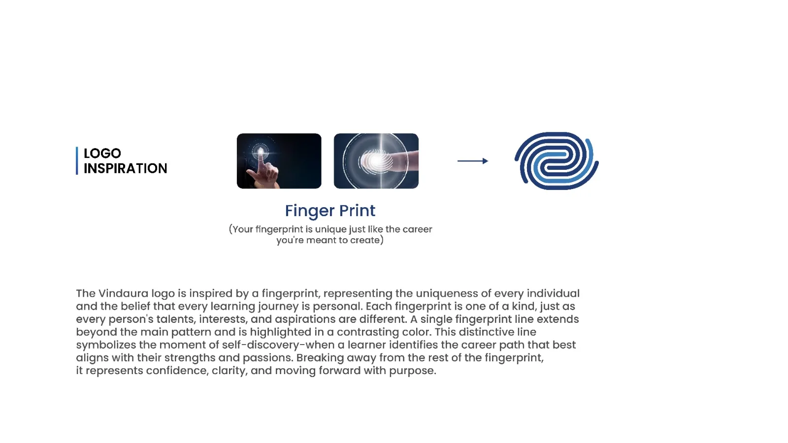
We started from a simple truth: no two fingerprints are alike, and no two career journeys are either. The Vindaura mark is built from a fingerprint pattern that represents individuality and the belief that every learning journey is personal.
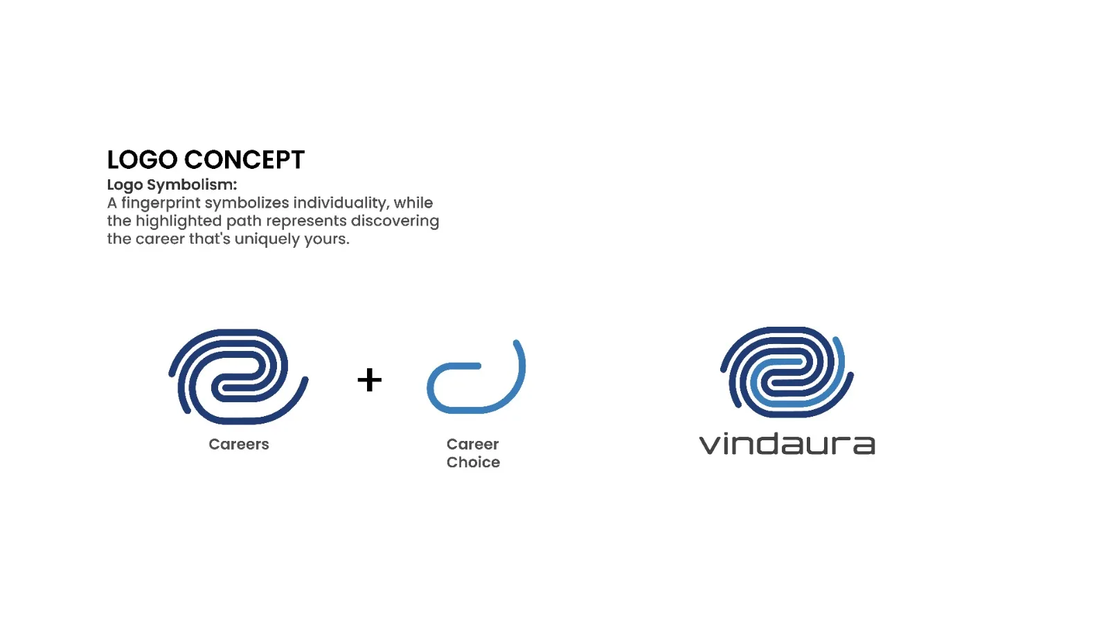
One line of the fingerprint breaks away from the main pattern and is highlighted in a contrasting colour. That single line is the heart of the logo. It stands for the moment of self-discovery — when a learner finds the career path that best matches their strengths and passions — and moves forward with confidence, clarity and purpose.
Colour Palette
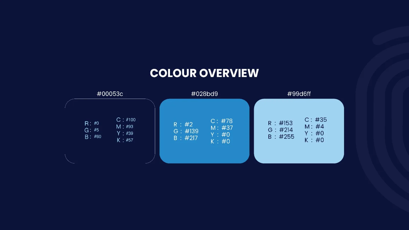
The palette moves from depth to clarity. Deep Navy (#00053C) brings trust and stability, Vindaura Blue (#028BD9) adds energy and confidence, and Sky Blue (#99D6FF) gives the brand a fresh, open and optimistic feel. Together they echo the journey from uncertainty to a clear path ahead.
Built to Work Everywhere
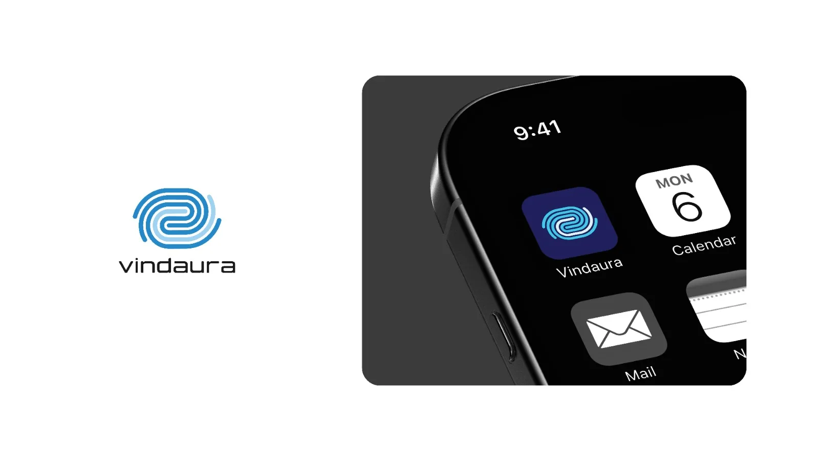
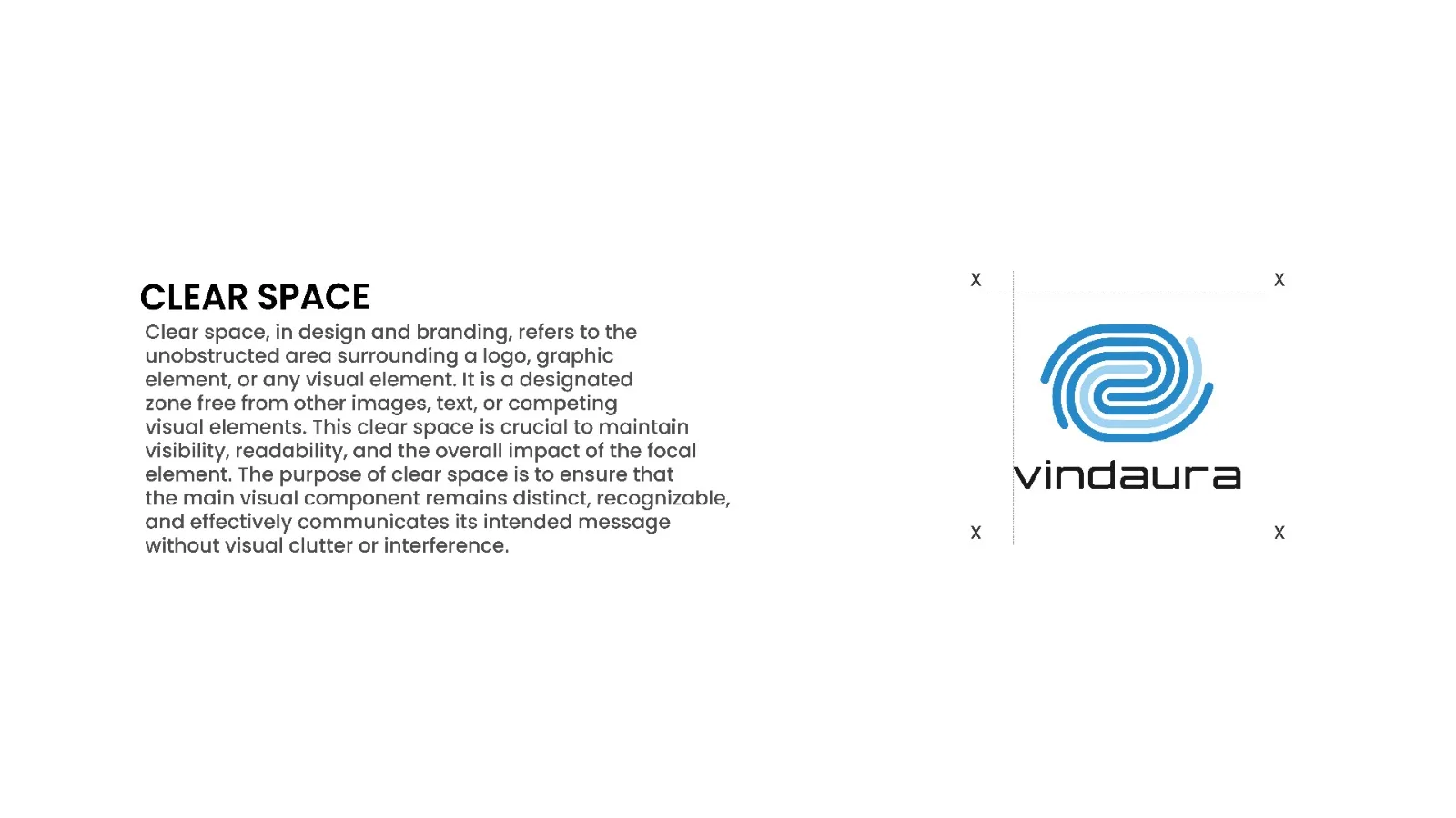
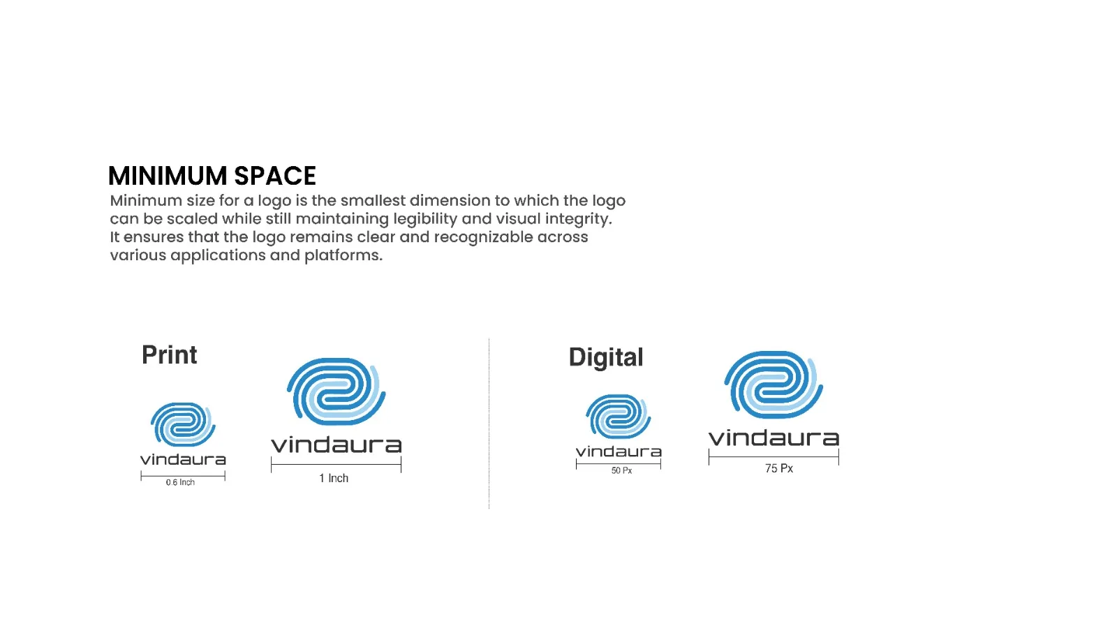
The identity comes with clear usage rules so it stays consistent across every touchpoint. A defined clear-space zone keeps the logo free from clutter, and minimum sizes — 0.6 inch in print and 50 px on screen — make sure it stays sharp and recognisable, from business cards to app icons.